Friday, March 30, 2018

Lab 6: Digital change detection

Introduction
The objective of this is to use two different forms of land use/land cover (LULC). The first form of change detection used was the a qualitative visual assement, the second was a quantifiable post-classification change detection.

Methods
Part 1: Change detection using Write Function Memory Insertion
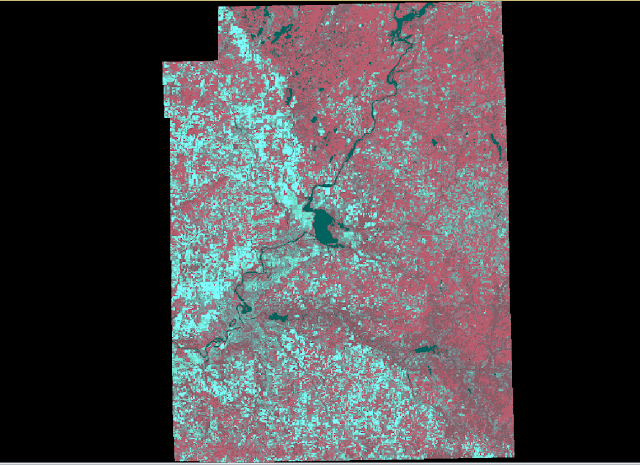
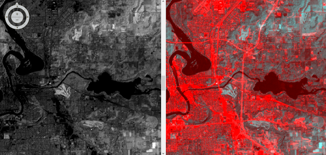
The first change detection method used in this was the write function change detection method. This method uses near-infrared bands over different dates placed into different bands (fig. 1). For this lab two images covering western Wisconsin were used. One image from 1991 and the other image from 2011. When the bands of the image were stacked in the combination shown below, areas that had seen change had pink tint (fig. 2). This method allows for an analyst to quickly visually inspect an area an see areas of change in a qualitative sense. While this method does show LULC change it fails to explain to the user which specific LULC classes have changed or the amount change that has occurred.
Figure 1. Color gun combination used to complete the Write Function change detection
Part 2: Post-Classification Comparison Change Detection
For the section of the lab, we were given two classified LULC images for the Milwaukee metropolitan area for both 2001 and 2011. The area of each of the LULC classified images was recorded in meters and converted to hectares in excel (fig. 2). The percent change for each of the classes was then calculated  for each of the LULC classes.
Figure 2. Excel sheet displaying the acreage for each of the LULC
Once this done, a new image was created that showed how the LULC classes had changed over then ten year period using the Wilson-Lula algorithm (fig. 3).
Figure 3. The Wilson-Lula Algorithm used to determine how the LULC had changed between 2001 and 2011.
Results
Part 1: Change detection using Write Function Memory Insertion
Figure 2. The image on the left was taken in 1991 and the image on the right in 2011. Areas of change can be seen in the pink color. For example, areas east of the city of Eau Claire had seen urban development and a new highway was built.
Part 2: Post-Classification Comparison Change Detection
Figure 4. Map created using ArcMap showing how the LULC for the Milwaukee metropolitan area had changed between 2001 and 2011. 
Sources
The images for this lab were provided by Dr. Cyril Wilson.
Saturday, March 24, 2018

Lab 5: Classification Accuracy Assessment

Introduction
In the previous two labs a supervised classification and unsupervised classification images were created. The objective of this lab was complete an accuracy assessment of the previously created images using ground referencing testing samples.

Methods
To begin the lab ground reference testing samples needed to generated in a reference image. This was done in ErdasImagine by having two views open, one with the classified image and the other with the reference image. Then using the accuracy assessment tool, 125 random points (reference points) were distributed throughout the reference image using a stratified random distribution (fig. 1).
Random points generated within the reference image for the unsupervised classified image. 
Once this was done, each of the points were assigned their land cover value (fig. 2). This was done for all 125 points for both classified images (fig. 3).
Figure 2. Classification values used to assign the land cover values for each of the random points
Figure 3. A portion of the list of assigned values for the random points for the unsupervised classified image.
Once the values were assigned for all 125 points for both images (250 total), an accuracy assessment was then generated for each of the two images (fig. 4).

Figure 4. Accuracy assessment created for one of the images. 

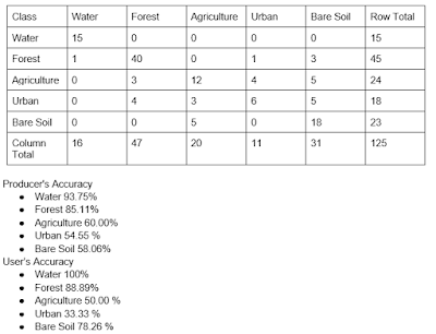
For each of the accuracy assessments an error matrix table was then created. This table displays the accuracy for each of the different classifications (fig. 5).
Figure 5a. Error matrix table created for the unsupervised classification image displaying both the user and producer accuracy for each land cover type.
Figure 5b. Error Matrix Table created for the supervised classified image. 
Results/Discussion
The overall accuracy for the supervised classification was 64% and the unsupervised classification was 72.8%. A potential reason for the unsupervised classification producing better results than the supervised classification may be that the training samples generated to create the supervised image did not accurately account for the variability among the spectral signatures for each class. This is especially true for the urban and bare soil classes. Both classification methods were accurate for the water and forest classes. This is because these areas have a relatively low amount of variability in their spectral characteristics. Both classifications had poor accuracy for the bare soil and urban classes. This is because these areas have similar spectral characteristics and the urban class has a very wide variety of spectral signatures within the class.

Sources
Images for this lab were provided by Dr. Cyril Wilson

Friday, March 9, 2018

lab 4: Pixel-Based Supervised Classification

Introduction
The objective of this lab was expand upon the image classification of biophysical and sociocultureal information from remotely sensed images through pixel-based supervised classifications. Building of the previous lab, this will specifically focus on the selection of training samples for a supervised classifier, evaluate the quality of training signatures collect and produce a meaningful informational land use/land cover classes through supervised classification.

Methodsdf
To begin the lab we were asked to collect training samples for a supervised classification using a Landsat 7 (ETM+) image that covered both Eau Claire and Chippewa Counties. To do this, we collected samples of 5 different landuses. Google Earth was used as a reference image to help determine land cover types. This land uses are water, forest, agriculture and bare soil. Each of the different land uses had a minimum number of samples required (figure 1).
Water was the first land cover type that signatures were collected for. Signatures were taken from lakes, ponds, and rivers to account for the various spectral characteristics that different water bodies produce. Once the spectral signitures were collected, the signitures were displayed a chart to make sure that they followed the expected profiles of water. In the case of this image, there were abnormally high values in band 1 which is more likely the result of atmospheric scattering. 
Example of a sample being taken on the Chippewa River
List of samples taken for the water class
Spectral profile for the water samples. 
This procedure was then repeated for the forest, agricultural, urban and bare soil classes.

Spectral Profile for the Forest class
Spectral Profile for Agriculture class
Spectral Profile for the Urban class
Spectral Profile for the Bare Soil class
All the spectral profiles were placed into a single plot. A convergence analysis the Evaluate-Separability function was used to see which four bands had the most separability amongst the different classes. The results showed that the greatest seperability was in bands 1,2,4,6. The average seperability score was 1976, which was quite good. All the training samples spectral signitures were then combined into their respective classes 
All four classes spectral displayed into a single blot
A separability analysis displaying the four bands that showed the greatest amount of separability (1,2,4,6) with a score of 1978. 
All individual spectral signatures combined into their respective classes and plotted together. 
Once the signatures were combined, the table was then saved and used to complete the pixel-based supervised classification. The new classified image was then imported into ArcMap where a final map was created.
Map created in ArcMap displaying newly created supervised classified image
Sources
The images for this lab were provided by Dr. Cyril Wilson

Friday, March 2, 2018

Lab 3: Unsupervised Classification

Introduction
The purpose of this lab is extract biophysical and urban information from remotely sensed images using an unsupervised classification system. Once the images were clustered by the classifier, the images were then reclassified into different land cover types using a thematic classification scheme. The scheme consisted of five different land cover types which were water, agriculture, bare soil, forests and urban.

Methods
Part 1
For this lab the ISODATA classification algorithm was used to classify an image that covered Eau Claire and Chippewa Counties. To begin the satellite image was brought into ERDAS Imagine. Once the image was brought in, the  unsupervised classification tool (fig. 1) was used to create a new clustered image. The clustered image was divided in 10 separate clusters based upon similar spectral characteristics. The next step of this was to identify and label each of cluster by its land cover type. These land cover types were water, forest, agriculture, urban, and bare soil. This was done by opening the classified image's attribute table (fig. 3). The clusters were classified into 5 land cover types with each type having a different color, water (blue), urban (red), agriculture (pink), forest (green), and bare soil (brown). 

Figure 1. Displays the settings used to create the classified image.
Figure 2.The classified image divided into 10 separate clusters
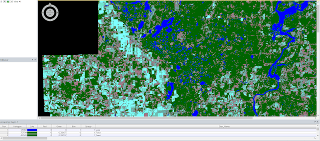
Figure 3. Areas in green have been reclassified into forest land cover 
Part 2
The next section of this lab was to run the same classification algorithm, only this time, increase the number of clusters and compare the final results. To do this the unsupervised classification tool was used again (fig. 4). The number of clusters were changed from 10 to 20.

Figure 4. Displays the settings used to create the classified image.
Results
Part 1
Below (fig.5) is the final product after the 10 image clusters were reclassified into in their respective land cover types. The final product did leave a lot to be desired. Because only 10 clusters were created there were many different areas that had different land cover types but were included into the same classification. This made classifying the different classes difficult as they all included different areas that were not part of the land cover type that was reclassified. This can be seen in the image below where red areas are to represent urban areas. While the cities of Eau Claire and Chippewa were classified as mainly urban, there were many areas that were bare soil included in the urban land cover class. This is most evident in the eastern section of the image. 
Figure 5. The reclassified image from part 1. The different land cover types are displayed in different colors, red (urban), green (forest), pink (agriculture), blue (water), and brown (bare soil).
Part 2
The results for part 2 were similar to that of part 1. The difference between the two was that part 2 produced an image that was more accurate. Because the number of clusters were increased from 10 to 20, the clusters were more accurate. This is because the increased number of clusters allowed for more diversity amongst the different spectral signitures. This was most evident in the agriculture class as not all crops have the same spectral characteristics. In part 1 many agricultural areas were classified into forest as the crops had similar characteristics of the trees. With the increased number of classifications these crops were able to be filtered out of those classes in part 2. Below is a map created in ArcMap using the reclassified image created in part 2 (fig. 6). 
Figure 6. Map created displaying the reclassified image after the 20 clusters were reclassified into their land cover type.
Sources
Images for this lab were provided by Dr. Cyril Wilson.

Lab 7: Object-based Classification

Introduction The purpose of this lab is to be introduced to the relativity new object-based classification scheme. This was done through t...